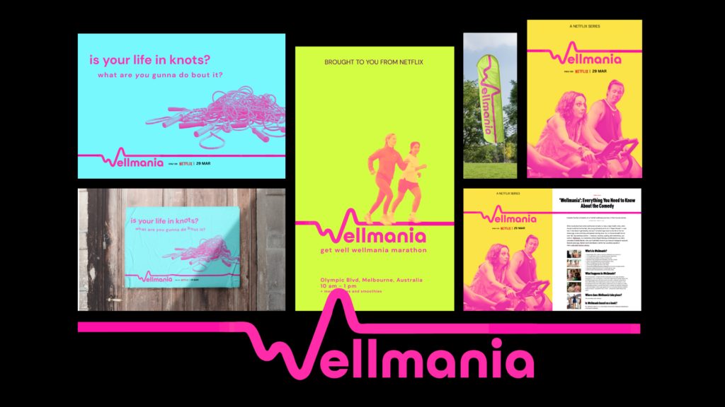

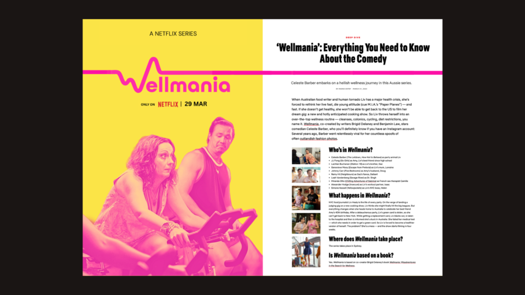
Wellmania is an Australian comedy series on Netflix, based on a novel. When Australian food writer and human tornado Liv has a major heart health crisis, she’s forced to rethink her live fast, die young attitude.
Target group: Real Regular People; millennial to gen x women, a fun weekend watch.
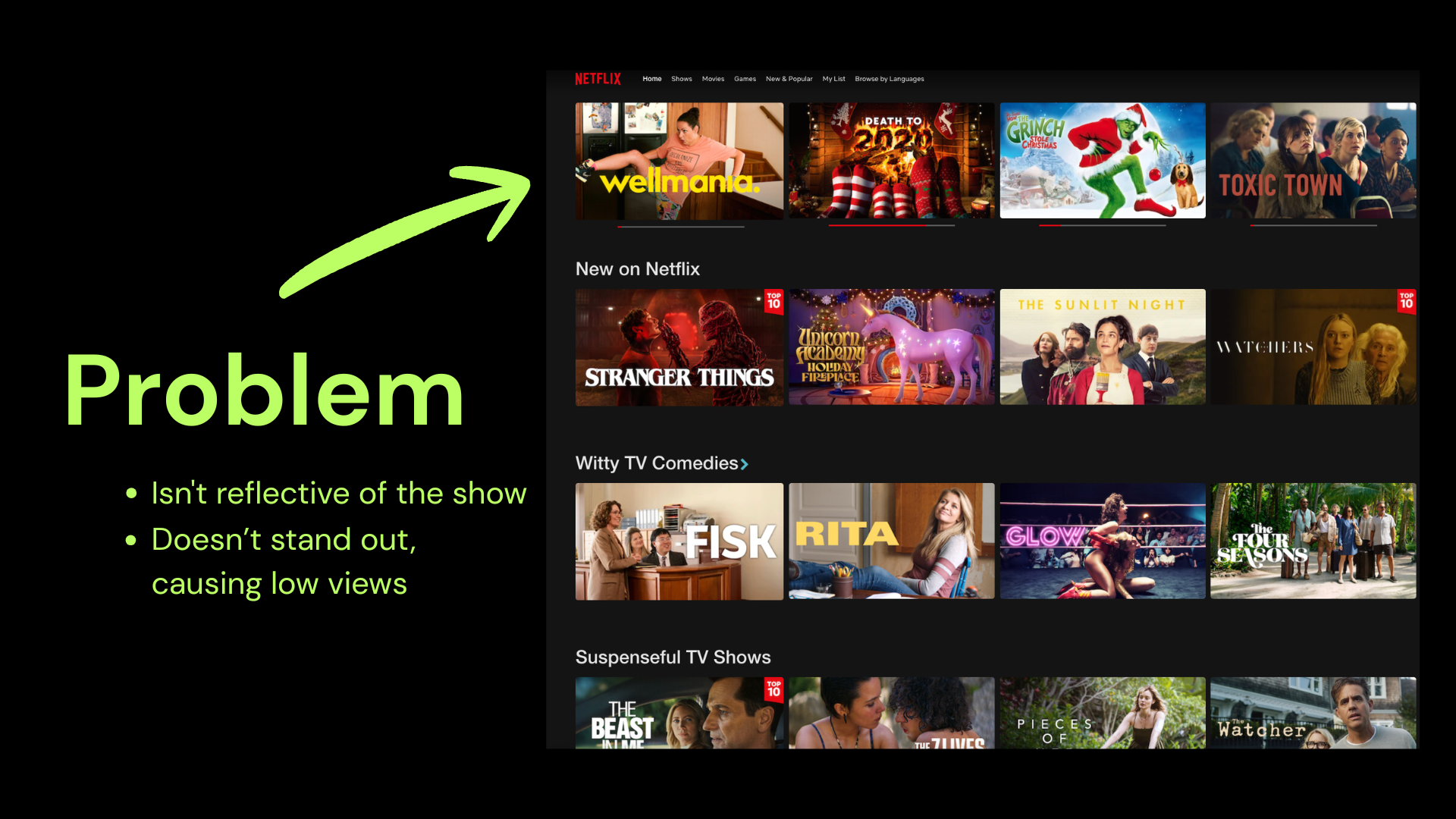
Great show, bland title design.
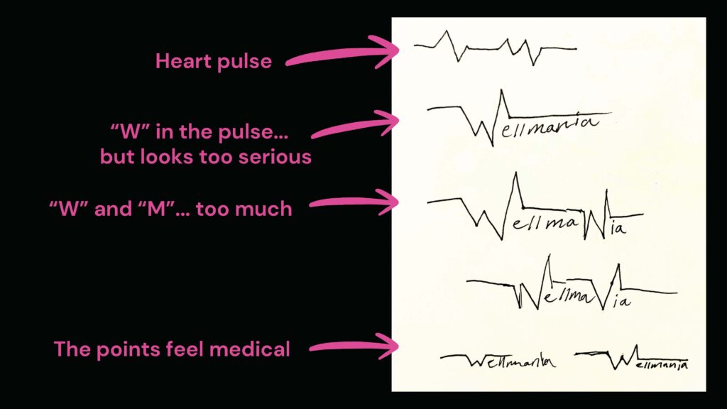
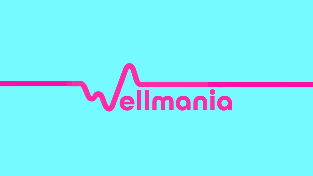
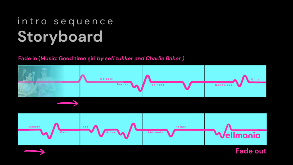
After a long process of scribbles, it became clear. It would be a heart line for her health scare (leading plot point), and by curving all of the hard edges, the medical feel goes away. I also choose a groovy round font paired with neon party colours to reflect the tone of the show.
Celebrating messy progress.
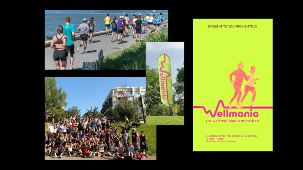
Major visibility with branded pinnies, a fun weekend activity to do before the show is relasesd. Partner with local fitness groups to have info booths on where you can join in the community.